Showing posts with label still life. Show all posts

Friday, March 8, 2019

Something to think about......

Title: "Fertile River of Gold"
Oil on linen - 24" x 18"

Again, I apologize that this photo of finished painting is a bit darker then what the original is.  Here's my thoughts when I placed these objects together.  Starting at bottom left & moving clockwise around the work.

1. Eggs represent ideas - thoughts yet to be manifested as visual representation; musical interpretation; mathmatic equation,; IMAGINATION 
2. Tea pot - heated water to help with growth of ideas.
3. Portrait of Einstein - Genious at work ( this tile painting was a gift to me by a close friend & talented artist that created it, Deb Baughman)
4. Flowers - represent ideas brought to life / manifested.
5.  Glasswork behind flowers - Transformation!  Glass is a product made of a solid, transformed into a liquid by using extreme heat, then cooled to create what we know as glass.  It's pure Alchemy.  This piece is also placed so a corner is pointing up....a symbol of heaven/ enlightenment....we could go on & on here.
6. Espresso cup & spoon - well, simply stated as ENERGY created by pure caffeine to stimulate the brain & firing of neutrons in the body.  And, no, I'm not addicted to coffee, but I do drink a Mt Dew now and then.  I like caffeine :D


Tuesday, February 19, 2019

"Blue on Blue" (with a kiss of Orange)

24"x18" - Oil on Belgium linen 

Here's the set up

During this winter, I've been embracing the magic of the Still Life.  Working on something like what you see here is helping me connect the dots between drawing and painting.

"Blue on Blue" is the third in a series of works I've started and I just realized, I'm subconsciously working with "SYMBOLS".  

I was introduced to the importance of symbolism when I worked in the Stained Glass industry as a glass painter / designer.   Our primary work load was restoration of church windows.... where I became very good with replicating Munich style windows that were popular during the 1800's in American churches.  

Man's need for visual communication dates back to the caveman and when glass was introduced to openings in cathedrals, storytelling continued with the stained glass created for this space.  Hidden inside a lot of church windows were designs of fertility, pagan symbols, and the more obvious of Christian symbols for the Trinity.  This included the colors chosen to represent higher conciseness.   

One example in my painting here is the 
"Pear".  
in Chinese culture - symbolizes immortality/longevity of life.
                                      Christianity - the pear represents the Virgin and Child.
                                      Korea - Grace and Nobility/ the Pear tree represents comfort.
                                      Koren Legend - the pear gives fertility which is interpreted as creativity 
                                                                 to  women.
In other folklore - represents affection/ bond of two people in love / justice / strength/ fruitfulness/ and salvation.

What I've noticed is there are a lot of like minded artists in the universe.  We seem to gravitate to the shape of the pear and will incorporate it in our paintings in many different ways. 

One more share here....I took the above finished work photo indoors. (and still have no way of adjusting color, etc. on my computer...it seems dark to me)   Below is a photo taken with the canvas outdoors.  Man-o-Man....the Blue really dominates.  Geez!


Thursday, October 25, 2018

Keokuk Reception Date Change


UPDATE CHANGE!!!!!!!!!!!!
Do to a "hick up" in scheduling in the space where my art show is, the Artist Reception for my one person show at the Round Room in Keokuk, IA is 
NOVEMBER 9TH   5-7PM

If you are in the area, I hope you will drop by for goodies, see the body of work and visit me during this event.  Artwork will be hanging the month of November.  

Sunday, October 21, 2018

One Person show month of November!


Keokuk Art Center , Keokuk, IA is sponsoring a one person show of my artwork created this year.  Most will be of paintings still in my possession from participation in plein air competitions plus a few still life compositions to break things up.

ARTIST RECEPTION NOV. 2nd
5pm to 7pm
at the Round Room - Keokuk Public Library.  
210 N 5th St
Keokuk, IA  52632

Sunday, February 25, 2018

It's all about the Clear Glass Bowl!


20"x 20" Gallery wrap stretched canvas

I'm still undecided about a title for this work.  .....could be "which one is not the same"  -  "Snack time". ...or the one I chose for this post.

I sometimes divide a canvas into sections, then work on either a similar subject in each space or choose to use different limited palette combinations to create  the same image.  It's a  fun exercise that can take on several different design elements .

This particular idea came from challenging myself with filling a glass bowl.  My hubby suggested painting a kitten laying in the bowl....I think There's no limit to what could be done.....hmmmmmm...only limitation is the size of my bowl.  For some reason, I have chocolate on my mind.  I may have to paint this bowl filled with Hershey Kisses.

Thursday, April 6, 2017

"Let's be Friends"


8x10 Oil on panel

This still life composition was set up by one of my oil students a few weeks ago.  The challenge was to focus on how the light creates shadows with these shapes.  I really liked what she had done and had to paint it as well.

Why all the black around the image?  Well.....I have a new computer and am still learning how to work the programs on it.  No "crop" tool like there was on my old Windows 7.  With a bit of studying, I'll figure this out and know I'll have a better way of filing photos then what I've done in the past.  I have a heck of time finding something right now.  My filing system is....well....there ISN'T a system.  That's about to change!  

Thursday, September 1, 2016

Stem Hanging On....


6"x 6"  Oil on panel

Ah.....it's PEAR SEASON!!!!.  This beauty once hung on our backyard neighbor's tree.  And....OH SO DELICIOUS!  Yep, it was eaten soon after my brush was laid down.

Apples and Pears seem close to even as favorite fruit for painting subjects.  I believe I have posed more pears under a single light source, just like this beauty here.  I love the play of shadows in still life settings and often try to include them in a composition. 

Thursday, August 25, 2016

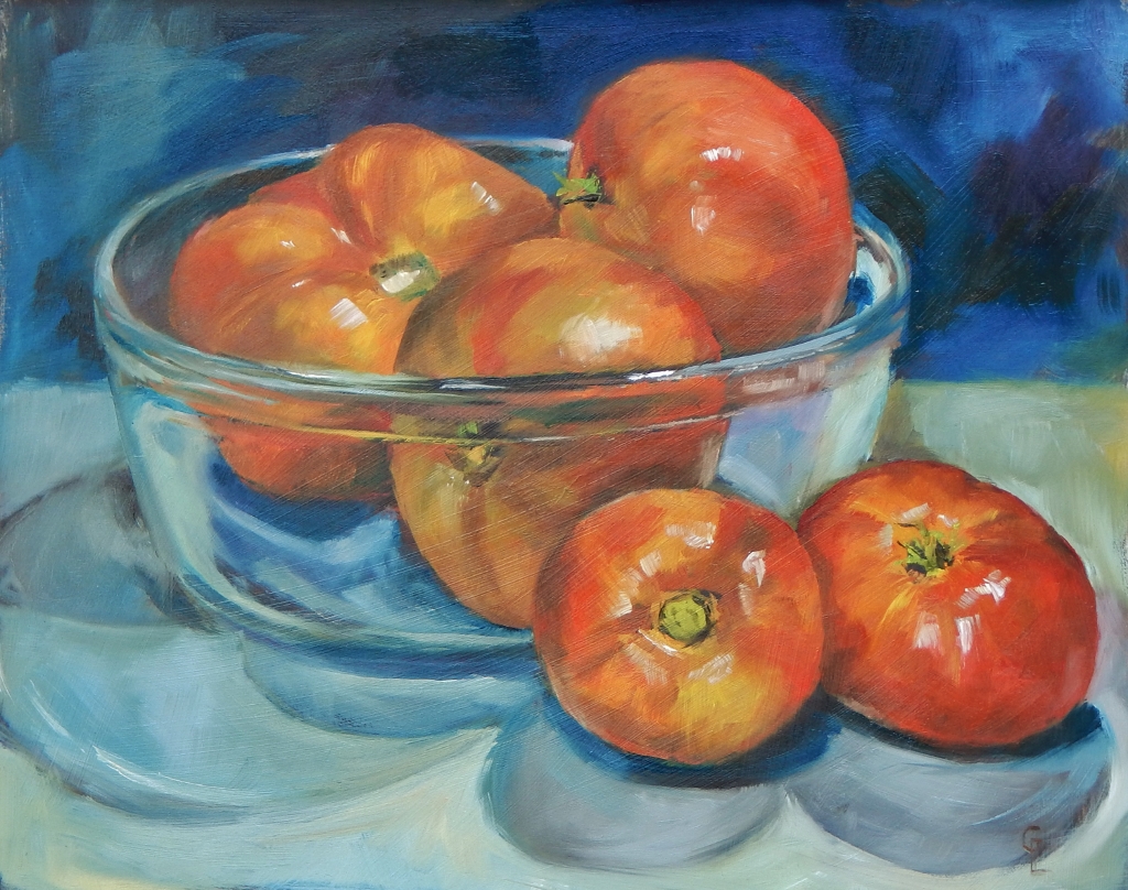
Luscious Red #1


8"x 10" Oil on board

The tomatoes are coming on strong in my garden right now.  So, what better subject for a still life right? I found a clear bowl in the house where I have a studio in Bentonsport.  Put that together with adjusting my light source and voila.......a cheerful lush painting!

I'm on a roll doing several food related still life's right now.  So, expect to see several of these posted in a row.  Enjoy!

Sunday, June 5, 2016

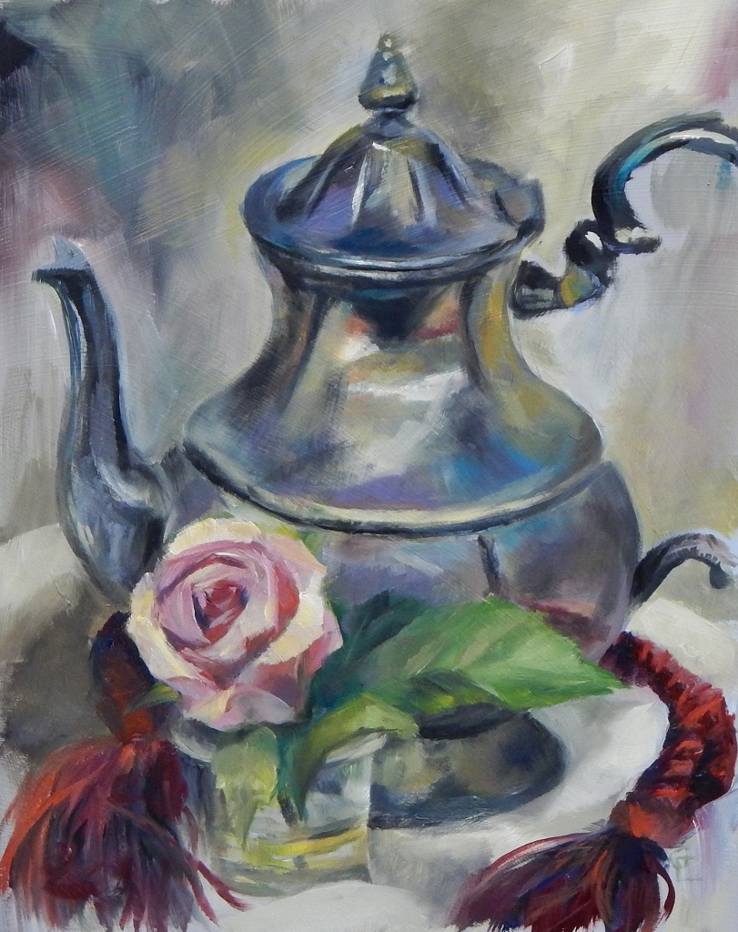
Sort of Formal!

10" x 8" Oil on board

One of my oil painting students brought an old silver creamer, platter, and this tea pot to class a few weeks ago.  I couldn't resist setting up this little still life to paint. 

Wednesday, May 11, 2016

"My Friends Tulips"


14"x 7" - Oil on Stretched Canvas

I was in need of having tulips for a specific project and a friend of mine just happened to have silk tulips that looked so real, I couldn't pass up painting them more then once.  This is the version I liked the best.  I wanted something different......so placed them laying sideways on a box so they would hang over the edge.

Thursday, November 12, 2015

A Buckskinner's favorites!

18"x24" Oil on board + frame

I'll post another straight on shot of this work when I have one.  For now, this shows the finished work on the easel at the Iron & Lace store.

You can see the edge of the photo I was using as reference.  Again, I prefer working from life, but that isn't always a convenient thing for me to do.  So, I'm soooooooo thankful for the digital camera.  I'm discovering my new phone can take some pretty decent shots too.  ( I have a Nikon L830 I carry around too)


Sunday, May 17, 2015

Buckskinner Measuring Spoons

~click image to enlarge~

6"x6" Oil on panel

This was a fun exercise in using a limited palette as Burnt Sienna being the dominate color.
These spoons were created by artisan Steve O'Grady of Bloomfield, IA.. He supports and participates in Buckskinner (Mountain men) Rendezvous through out the Midwest.

A small group sets up camp every year in Bentonsport along the Des Moines River during the villages open business season.  I couldn't resist this set of measuring spoons hand forged by Steve. 

Wednesday, February 25, 2015

Pink! Pink! Pink!


Here's the beginning sketch.  I've used Art Spectrum Colourfix fine tooth pastel & multimedia primer to coat a stretched canvas.  I slightly sanded the last coat to knock off the extra texture that is necessary for using with pastels.  

I've been  using this primer for all my work lately.  I provide panels primed with this stuff for my pastel & oil class students too.  Last night, one of the students brought in a canvas panel to paint on and said she really noticed the difference and preferred the texture of the colourfix primer.


Here I'm establishing my lights and darks and filling in the background.


This is the finished work on the easel.  I decided to show it this way and cropped so you can see all the edges.  I like leaving some of the canvas surface showing....not "finishing" the oil painting 
edge-to-edge.  I guess you could call this technique a "carry over" from drawings and pastels paintings I've done for years.  Nothing like being consistent. :D

~click on images to enlarge~
.....and the final piece cropped.   24"x 18"  Oil on stretched canvas.
(editing note.....the purples (darks) in the painting aren't as intense as shown here.  The digital camera really picks up some colors more then others.)  

Sunday, February 22, 2015

Lovely in Red

 
24"x 18" Oil on stretched canvas

I apologize for the sorta out-of-focus picture here.  I angled the painting so I'd cut down on the wet paint glare and the glass looks weird too. (still managed to pick up that "special sparkle" from wet paint at the top of the picture too. Sigh!) 

I'm still working on taking better quality pictures.  I've read about several ways to accomplish this but I still mess up sometimes.  Because I was anxious to post this painting, I decided to use this image anyway.  It isn't daylight yet outdoors (my main source of picture taking light) so, later today, I'll take another series of shots and see if I do better then what's here.

Meanwhile......enjoy!

Saturday, February 21, 2015

"Then there were Two"

Click image to enlarge
10"x 8" Oil on stretched canvas

  It's such a challenge for me to make a yellow or white rose look like what they are. There's more color going on there then you notice at first.  Grays, dull purples/blues......you have to mix some of these in to create the value range needed to make the flower Pop.   

Of the flowers in a bottle paintings I've posted so far, I think this one is my favorite.  I'm finally managing to loosen up - how I apply  my strokes....LEAVE THEM ALONE.....not go back over and over and start creating too many sharp"edges" or completely blend color together on canvas.   

If I keep working the paint, I begin to dissect my subject and get rapped up in the details.  That's not my goal when I begin a painting.  Sound familiar?...like....the subject of "overworking" a piece?

 The more I paint, the more I focus on the bigger shapes before me.  When I worked exclusively in pencil, I would focus on showing even the smallest detail (like eye lashes) when doing a portrait.  Yes, I'm re-training myself to not get so tied up in the details.

Hmmmmmm., sounds like life posters I've seen...."Don't get hung up on the small stuff". 

I also have to share a quote I have on a posted note by our computer.....
"Art washes away from the Soul the dust of everyday life." - Pablo Picasso 

This could be said about music too!  I think that's why I love hearing my son play when I visit him.  Reminds me of listening to my dad play the violin...his true passion.  My Dad could make the instrument "sing" and my Son does the same thing with his guitar.

Wednesday, February 11, 2015

Whisper White

10"x 8" Oil on stretched canvas

I'm on a roll........loving the glass/flower compositions.  Now, to see how many I paint! This one was a challenge in keeping the petals pure "white".  Gotta have color there somewhere.  Gray just makes it look lifeless.  

I absolutely LOVE Roses......but......find them to be hard to paint!  So, that's the challenge!!! :D

Monday, February 9, 2015

Pretty in Pink!

Oil on stretched canvas - 10"x 8"
Yep.....most definitely thinking of warmer weather!  When I begin to paint flowers, my thought process is a given. I'M READY TO PLAY IN THE GARDEN!

I've been teaching (on going) an oil painting class at the Courtyard Gallery & Studio in Bloomfield, IA on Tuesdays.  One of my students asked specifically to learn to paint glass.  What I've shared with her is that I approach this material the same as painting anything else. ........don't let your mind trick you in just thinking "glass".  Look for the value ranges in colors and "record" what you actually "see" before you. 

Breaking any scene down in this manner gives you more of a likeness. ALWAYS a challenge for me is getting that curve of the bottle to look the same on both sides.

Saturday, February 7, 2015

Thinking of Spring.....


Oil on panel in wood frame 22"x 18"
I like "spilling over", so to speak, on my wood frames sometimes.  I've created several oil paintings the past few years where I incorporate the frame into the finished image.

This arrangement of Tulips caught my eye several years ago in an antique store. I'm so thankful for cameras.  I'm inspired to paint so many different things.  I loved how the light came through the window here and made wonderful contrasts in values. (There was NO WAY I could set up an easel and paint in this busy location.)

My picture taking skills are still ...."a work in progress".   I've managed to catch the glare off the wet surface at the bottom of this work.  Still, I wanted to share how this painting turned out. 

Friday, February 6, 2015

Poppy Love


Here's the "set up"......  I've taken a canvas sheet and mounted it on archival foamboard.  I love Poppies.....wish I had them in our yard but there's truly no room for a nice patch of these beauties.  :(  (Oh, and Yes, that "ghostly figure in the background .........my husband is in the other room watching SouthPark)


Here's the initial sketch .....I really like how the undertone looks so I'm making it a part of the composition.

.....and the blocking in of color values begins.....

Here's the finished work!  (There's a little glare from the overhead light at the top of the picture)
"Poppy Love"  20"x 16"  Mixed Media (background is Acrylic - painted image Oil)

Wednesday, January 21, 2015

Love Glass Glass Glass.....

Here's the work set up......I LOVE MY NEW PAINT BOX & CANVAS HOLDER!!!
(for more information on this set up, please email me. ginlammert@yahoo.com)

Yes, I'm working from the computer monitor.  I need to invest in a tablet so I can truly be mobile.  The pics I print off just don't look the same.....not as vibrant as what I can view from the monitor.  Of course, the BEST solution would be to work from life.  That, unfortunately, can't always happen.  I'm thankful for a good camera. :D

Here shows where I've established the basic composition and started adding my value range.  The canvas board has a slight tone ( light value range).  I just find it hard to work on white. 

Okay.....lights and darks added....check!

....and the end result.  

 "Bottle Study #2"  10" x 8" Oil on canvas board